An Impressionist Wedding in Provence: Light, Colour and a Painterly Palette
- Mar 23
- 7 min read
There are certain projects where the design is not about creating something new, but about drawing together threads that already exist - a place, a story, a set of references- and shaping them into something cohesive, considered, and deeply personal.
This was one of those projects.
Set in the South of France at Bastide de Laurence, the celebration unfolded as a series of moments inspired by art, landscape, and the couple’s shared visual language with each part of the weekend building gently upon the last.
When we designed this wedding in Provence last summer, the design concepts we created almost a year ago now to the date centred around a palette drawn from Impressionist paintings - using soft greens, buttered yellows, delicate pinks - colours that feel as though they have been lifted directly from canvas rather than constructed for an event.
Months later, the same tonal language emerged on the runway, as Jonathan Anderson presented his collection for Dior, widely noted for its references to Claude Monet and the broader Impressionist movement.
It was a quiet reminder that the most enduring ideas are rarely trend-led, and that they often surface across disciplines, all at once.


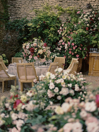
WELCOME DINNER
AN ODE TO L’ISLE-SUR-LA-SORGUE
The welcome dinner was rooted firmly in place.
During the design process, I travelled to Provence multiple times, spending time in the antique markets and courtyards of L’Isle-sur-la-Sorgue - studying the textures, materials, and palettes that define the region. What stood out was not just the aesthetic, but the feeling: spaces layered over time, relaxed yet structured, expressive without excess.
At the outset, the bride had been drawn to a more traditional, colonial-style aesthetic. Alongside this came other preferences - colour, pattern, differing influences - and my role was to refine and distil these into something that felt cohesive and appropriate to the setting with a clear story and design direction for vendors, developing the details with creative decisions and sourcing rentals both in the UK and locally in France.
The resulting palette for the welcome dinner needed to feel cohesive but have it's own "moment" so I moved the palette towards deeper, more grounded tones: sage and darker greens, deep raspberry and softened pinks, pale stone, dark wood, and light rattan. Materials were chosen for their honesty and connection to the region, allowing the design to feel anchored rather than imposed.
A bespoke textile print was commissioned from my brief, developed specifically for the setting as something entirely new. It was hand drawn by the bride, digitised and then introduced with restraint through custom linens, adding rhythm and character while allowing the architecture and materials of the space to remain central. I chose tableware rich in detail featuring romantic lace chargers and toile de joy print plates, delicate cut glass and antique silverware.
The overall intention was for the evening to feel as though it had always existed there - sun-warmed, layered, and quietly elegant.


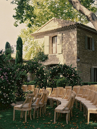
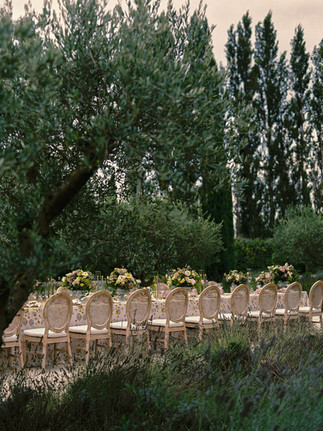
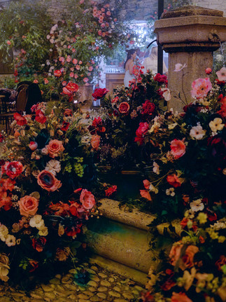
CEREMONY
A PATHWAY THROUGH THE GARDEN
The ceremony began with the couple’s story and the bride’s identity as an artist.
With a proposal in Paris, a shared connection to painting, and a Monet book gifted after visiting the museum, I began the design process by looking at the extensive works of Claude Monet, the gardens of Giverny, and the wider world of impressionist and en plein air landscape painting - where light, atmosphere and movement shape the scene as much as form itself.
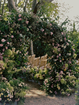
During the research process, I came across a painting of rose arches by a more modern artist called Greg Singley whose composition immediately resonated - the repetition, the depth, and the way it drew the viewer through the space to a woman dressed in white partially hidden by the flowers. This became a defining reference point, inspiring the series of floral arches that framed the ceremony aisle.
From there, the idea evolved into a real-life interpretation of a pathway through a painted garden - soft, romantic and immersive, as though stepping into an artwork. I was also drawn to the dreamlike quality of artists’ garden scenes more broadly: the softness of figures moving through nature, the filtered light, the pastel atmosphere, and the sense of a moment half-lived and half-painted.
Set within the trees at Bastide de Laurence, the ceremony was designed as a play of light, colour and perspective - with the repeated arches drawing the eye forward and creating the feeling of movement through the landscape. It was intended to feel painterly rather than ornamental: a scene shaped by the couple’s story, by the bride’s own relationship with art, and by that romantic notion of nature as artists so often depict it.
The palette of soft greens, buttered yellows and washed pinks emerged from a layering of references rather than a single source. There were echoes of Cobblers Cove in Barbados, long associated with Katie’s story and early plans for the celebration, alongside the painterly influence of Claude Monet and his early works - those water-softened tones of lilies, landscape and reflected light - and the interior design style of their home in The Cotswolds.
Interestingly, almost a year after we created the design plans, a remarkably similar language appeared on the runway, as Jonathan Anderson presented his collection for Dior in Paris, where greens, yellows and pinks played out across a set design reminiscent of floating gardens. A quiet alignment that feels even more fitting at the bride chose to wear a Dior dress for part of the celebrations.


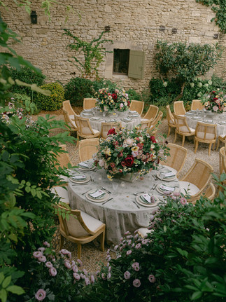
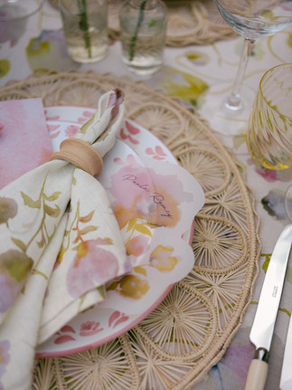
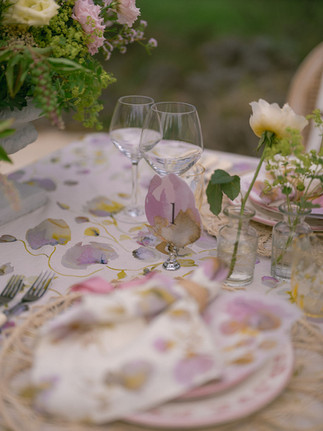
THE TABLESCAPE
AN IMMERSIVE PAINTING
The tablescape was conceived as an immersive painting brought to life - a continuation of the artistic thread running through the celebration, but translated into something guests could physically sit within.
Drawing on the bride’s earlier works, particularly her abstract floral paintings in yellow and pink, I developed a palette that brought together not only her artistic language but the couple’s personalities and references more broadly. Yellow carried personal significance for the bride and her late grandfather, while pink reflected the groom’s love of colour, pattern and interiors. From there, I refined the palette so that it felt expressive yet resolved, rooted not only in those personal meanings but in the tones of places and interiors that mattered to them.
We commissioned new paintings from the bride specifically for the setting, with clear direction to ensure that the work felt in keeping with both the architecture and landscape of the venue and the couple’s combined aesthetic. The aim was never to place art onto a table, but to build a table that felt as though it had emerged from the artwork itself.
From there, I directed the translation of those paintings into textiles and layered the tablescape with hand-painted tableware, florals in tonal harmony, and stationery elements on translucent paper so that the whole composition had depth, softness and movement. We designed and printed painted details for the paper goods, allowing those layers to extend right down to each place setting.
What mattered most was that it felt immersive: not just colourful, not just decorative, but like a three-dimensional composition where art, setting and personal narrative were all in conversation. Romantic and painterly, but still grounded in the environment and the story of the couple themselves.


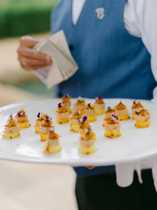
FOOD & EXPERIENCE
Food was approached as an extension of the environment and the couple's personal preferences- seasonal, local, healthy, and thoughtfully composed.
Working closely with our French catering team, the menus were shaped around freshness and balance, allowing the quality of ingredients to lead. The rhythm of dining was considered within the wider flow of the celebration, ensuring each moment felt natural and unforced.
Music followed a similarly considered structure, beginning with a classical foundation before gradually evolving into more expressive live elements and, later, a more energetic atmosphere for the evening.
Together, these elements created a sense of continuity - each part of the experience building upon the last.


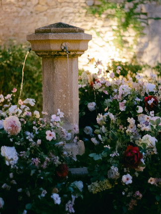
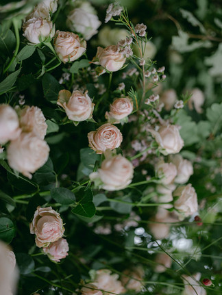
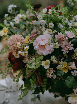
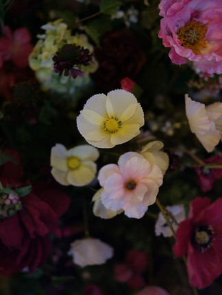
FLORALS
STRUCTURE, MOVEMENT, AND ATMOSPHERE
Florals played a central role throughout, not simply as decoration, but as a key design medium.
From the sculptural arches of the ceremony to the layered arrangements across the tables and softer installations throughout the setting, each element was designed to contribute to the overall composition.
The ceremony installations, in particular, required a collaborative approach with multiple florists working together to achieve the scale, rhythm, and natural movement of the arches.
Across the celebration, florals shifted in tone and intensity from architectural to romantic - always in dialogue with the landscape and the light.
This was the work of an exceptional team whose craftsmanship and sensitivity to form brought the design fully to life.


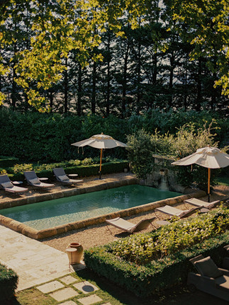
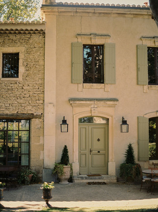
THE VENUE
BASTIDE DE LAURENCE
The search for the setting began far beyond Provence.
Initially, the brief considered celebrations in both the UK and Barbados - two very different expressions of place and atmosphere. But as the direction evolved, so too did the question of location. What emerged was a desire for something altogether more specific: a sense of ease, of sun-washed elegance, and of understated beauty that felt both cinematic and deeply personal.
I explored a number of venues across Europe and beyond before arriving at Bastide de Laurence - a setting that held the balance perfectly. There was something in its architecture and surrounding landscape that spoke to both references we had been circling: the relaxed glamour seen in the works of Slim Aarons and the softness of a fine art sensibility.
It offered structure without rigidity, beauty without excess - the kind of place that allows a design to unfold naturally, rather than compete with its surroundings.
In a small and rather lovely coincidence, I later discovered that an entirely separate client of mine had spent childhood summers there, visiting close family friends who own the property. One of those unexpected threads that seems to run quietly beneath certain places - a sense that some settings are returned to, rather than simply found.


CREDITS
Event Planning, Design & Creative Direction: Studio Sorores
Bespoke Artwork & Textile Design: Katie Julia
Venue: Bastide de Laurence
Photography: Tammy Shun, Kylee Yee, Stories from Eros, Weddings by Laura Jane
Film: Stories from Eros
Content Creator: MB Weddings
Post-Production & Photographic Art Direction: Katie Julia
Fresh Floral Design Lead: Paula Rooney
Faux Floral Design Lead: Fleur de la Couture
Floristry Team: Fox Flora, Briege, The Little Flower Atelier
Linen Production: Alba Linens
Stationery: Rose & Ruby
Table Rentals: The Luxe Collection UK + Frederic Bernard Traiteur
Furniture: Balm Rentals + Be Lounge
Catering: Frederic Bernard Traiteur
Music: Young Guns
Production: Twelve in a Box
---
With sincere thanks to every collaborator who contributed their craft, care, and expertise to bringing this project to life.


