The Unexpected Red Theory: Wedding & Event design Colour Trends
- Feb 27, 2024
- 2 min read
Updated: Mar 14
The concept of "unexpected red" has been appearing on social media a lot recently. The idea being that adding a pop of red in a place where it doesn't necessarily match, will make the space feel more interesting. Taylor Migliazzo Simon started it with a viral TikTok video, and it was soon being seen everywhere - particularly on Instagram.
The idea resonated through interior design trends, and slipped into fashion styling too. In reality it's less about using the specific colour red, which is having a real moment, and more about doing something a little unexpected. Visual interest, a pop of contrast, a little personality in an otherwise simple colour palette.
So this year we are sure to see more rich cherry reds, deeper burgundys and orange toned warm red accents popping up in wedding and event designs (and bridal party fashion) too. I think it will probably have some staying power given it's actually quite a classic colour to use in any design palette, so will not date quickly like some colour trends. It kinda looks good with everything!
When using it in design concepts for a party or wedding celebration, liken it to when you put on a red lipstick or get a classic red manicure. It's an accent colour that you just know will work with any outfit. Why? Well, with any colour palette you want to create a balance of those popular saturated and muted colours with something more fresh and bold in shades and tones that complement them in the colour wheel. Rather than going for a red "theme" you'd use it more balanced and with tasteful touches throughout, for example a wine red pattern in a floral linen or a tomato red accent in the flower arrangements picked up again in scatter cushions for your lounge area near the dance floor.
Personally I prefer to use red with complimentary, monochromatic or analogous colour pairings (see more information on the colour wheel theory here). I love using different variations of it with contrasting cool tones, like blue or green, for balance and adore it with yellows and oranges for something warmer.
The more subdued wine or burgundy red shade is likely to be popular in wedding design - a perfect colour for that eclectic and slightly darker English countryside manor house aesthetic - which is often popular for destination weddings in the UK.
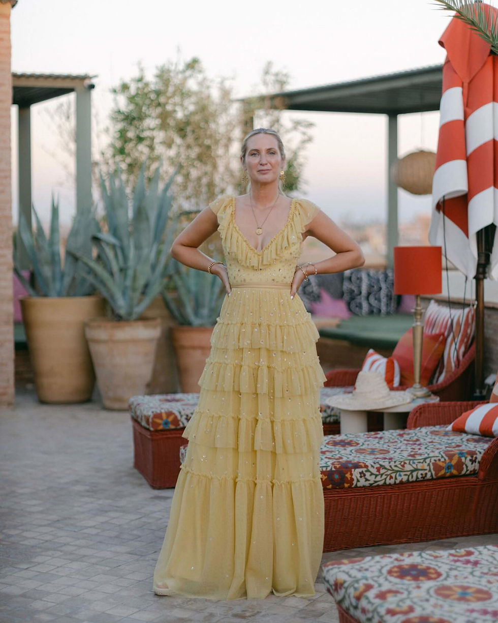
Olive green, pale muted yellow and teal mixed with both bright bold red and deeper burgundy tones is a colour palette we are here for! Much like the images used in this birthday party celebration hosted on the rooftop of El Fenn in Marrakech.


All images by Katie Julia for Studio Sorores


